From Traffic to Transactions: Designing an eCommerce Website That Sells
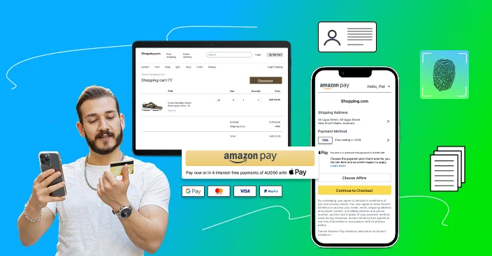
Table of Contents
Attracting visitors to your eCommerce site in Australia is only half the fight. The true problem is turning that traffic into paying customers.
Most online stores rely on precision-engineered design rather than luck or brilliant marketing to get conversions. Every button, picture, content, and website contributes to converting surfers into possible buyers.
When creating a website, aesthetics are more than simply showing. It involves psychology, usability, trust, speed, and narrative. In this detailed guide, we explore how to design an eCommerce experience that not only attracts attention but actively drives transactions.
What is the perspective of the client?
Usually, this road starts with being aware. “Can this brand help me solve a problem or fulfil my desire or wish?” is the question that consumers ask when they find a brand through search engines, social media advertisements, influencer referrals, or word-of-mouth.
The finalisation stage starts as soon as they click on your website. They evaluate your value proposition, explore your product range, and weigh options. This is where design must speak volumes. Navigation should be intuitive.
Content must address pain points. Product images should captivate. If the Aussie customer feels friction or confusion at this stage, they’ll bounce.
Finally, in the decision phase, trust becomes the dominant factor. Do you offer a return policy? Are there reviews from real customers? Is the checkout secure and fast? Does the product truly appear worth the cost?
Your design should anticipate and address these difficulties before they happen. A great layout guides the user through the journey easily, removing concerns and building confidence at each stage.

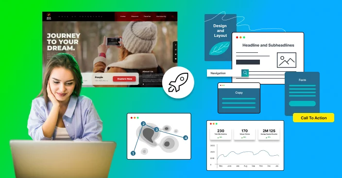
Making an Effective First Impression
When a visitor first lands on your homepage—or any landing page—the visual and emotional tone must be set immediately. Your hero section is ground zero. This is where your value proposition, brand identity, and core offer must be communicated within seconds.
A great hero picture or video should depict real-world applications of your product. Show a hiker in the middle of a challenging route encircled by mountains, for example, if you sell outdoor equipment. The picture should be professionally taken, emotionally captivating, culturally appropriate, and visually beautiful.
Your unique selling proposition should be clearly stated in an attention-grabbing headline that appears next to or over the picture. Think along the lines of “Conquer the Cold in Style – Durable Jackets Built for the Wild.”
Avoid confusing or generic slogans. Be direct. Be persuasive. Your call-to-action (CTA) should be prominently displayed below. “Shop Now” is effective when the context is apparent, but “Explore Winter Gear” or “See Bestsellers” may give greater guidance.
Trust elements, especially at this early level, should not be hidden. Display shipping regulations, warranties, customer feedback, and press mentions toward the top of the page. From the first scroll, visitors will be reassured that they have arrived at the right spot.
Intuitive Navigation and Seamless Exploration
Poor navigation design is one of the easiest ways to lose a sale. Visitors should be able to locate what they’re seeking quickly without feeling overloaded or confused.
The main navigation bar should have obvious, wide categories, ideally with dropdown menus for nicely organised subcategories.
For example, an apparel website can start with gender “Men,” “Women,” and “Accessories,” before moving on to more different categories such as “Outerwear,” “Shirts,” and “Pants,” and so on. You don’t need to create or design too many menu items or categories. Simplicity always wins.
A highly visible search bar is essential, especially for returning users or those with intent. To improve usability, include autocomplete recommendations and the option to filter straight from search results.
Breadcrumbs are another underappreciated aspect of effective design. They assist people in navigating your site and make it easier to backtrack or explore related topics. For Australian users deep in a catalogue, this is a subtle yet effective sort of reassurance and control.
Product Listings that Drive Engagement
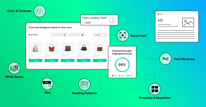
When consumers visit a category or collection page, the layout encourages research while making it simple to discover possible purchases. High-quality photographs are useful; thus, each product thumbnail should be crisp, well-lit, and with a consistent aspect ratio.
Every product listing must have the following details: name, price, review score (if relevant), and fast action buttons like “Add to Cart” or “Wishlist.”
Do not rely solely on hover effects to convey important information, especially on mobile devices.
Filtering and sorting tools should be clearly displayed and simple to operate. Allow consumers to filter goods by size, colour, price, popularity, and customer rating. “Bestselling” or “Recommended” are usually the default sort order that reflects user intent rather than being random like alphabetical order.
Clarity is your aim, regardless of whether you use pagination or continuous scrolling. For customers who prefer mobile devices, endless scrolling is helpful, but to maintain control, offer features like “Back to Top” or lazy-load sections. With pagination, make sure the navigation controls are big and responsive.
Designing Product Pages That Convert
In the majority of online purchases, the product description page (PDP) is the decisive element. The design should be focused, instructive, and interesting without being overbearing to the user.
Begin with a collection of high-quality images. Allow consumers to zoom, rotate, and observe the product in use. User-submitted photographs, when filtered properly, enhance authenticity and social evidence.
Product information should be organised to the right of the photographs for ease of comprehension. Start with a concise product title, followed by the price. If a discount is applied, strike through the previous price and highlight the new one in a distinct colour.
A quick summary of product highlights, 3-5 bullet points, should follow. Focus on the advantages, not the features. Below that, size, colour, and number dropdown selections must be fluid and intuitive.
On mobile, the call to action, usually “Add to Cart”, should be visible enough to click on it, high-contrast, and sticky. Supporting buttons such as “Add to Wishlist” and “Share” can be smaller and less visible.
Reviews are a major part of a website. It’s one of the most important parts of a website, which should be easily accessible and visible.
Show an aggregate rating with a breakdown of stars, then display user-generated reviews sorted by relevance or helpfulness. Include filtering options for these reviews. A well-structured Q&A section below helps new clients find answers to frequent questions.
Further down the page, there is a thorough description, product specifications, and care guidelines. Shipping and return information should be apparent and not concealed in a different policy page. The goal is to remove every point of hesitation.
Check out Simplicity and Speed
A visitor is almost ready to buy when they add an item to their cart. You should have the easiest and most comfortable checkout experience possible.
You ought to see a side cart or slide-out confirmation when you add an item to your cart. It enables the user to inspect the goods in their basket, change the quantities, and proceed uninterrupted to the checkout.
The checkout procedure should be simplified into a single, straightforward flow. Offering guest checkout is essential, and forcing account creation drives abandonment. If account creation is desired, prompt it after purchase.
Use a progress bar to show stages (Cart → Shipping → Payment → Review), and minimise form fields by using smart defaults and address autocomplete. Mobile optimisation is necessary: all fields should be easy to tap, and inputs should activate the appropriate keyboard.
Payment choices should be various and properly stated, such as credit cards, PayPal, digital wallets, Buy Now Pay Later, etc. Lock icons, HTTPS, and trust badges (Norton, McAfee, PCI compliance) provide reassurance to users.
Finally, the confirmation page should seem like a beginning rather than an end. Display a summary of the order, an expected arrival date, and options to monitor the parcel, follow on social media, or check out complementary products.
Building Trust Through Design
A website that lacks trust aspects will not convert, even if it is attractively designed. In addition to being expressed through guarantees or security indications, trust is also deeply embedded in the tone, continuity, and transparency of your design.
Display your return policy. Provide a money-back guarantee. Use genuine testimonials and user-generated reviews. Highlight any press coverage or available influencer mentions. Reinforce security through familiar payment processor logos and seals.
Social proof, such as live sales notifications or “X people are viewing this now” alerts, may provide a sense of community and urgency when used wisely. Always choose sincerity over gimmicks.
Performance, Speed, and Mobile Responsiveness
If your website runs slowly or ruptures on mobile devices, all of your design knowledge is useless. Prioritise information above the fold, load scripts independently, and compress all assets. Use slow loading for photos below the scroll.
Ensure that your design is entirely responsive. Instead of merely shrinking data to suit the screen, this entails altering the layout, button locations, font sizes, and form interaction for touch. Given that over half of all online sales are now done on mobile devices, think about designing with mobile devices in mind.
Iteration, Data, and Optimisation
Launch is not the end of design. Use session logs, Hotjar, and Google Analytics to track how visitors interact with your site. Keep a watch on key performance measures such as total conversion, checkout drop-off, add-to-cart rate, and bounce rate.
Conduct A/B tests to assess changes. Try alternate headlines, graphics, CTA positions, and checkout routines. Use feedback loops, such as post-purchase questionnaires, to discover what users liked or disliked.
No website is ideal from the beginning. Treat your eCommerce design as a live system that adapts to user behaviour and input.

Final Thoughts
A great deal of attention to detail is a basic step and requirement when you’re designing an eCommerce website that genuinely sells.
It shows thoughtful thinking, deep testing, and user empathy. From the initial impression to the last confirmation email, every touchpoint provides a chance to increase trust, reduce tension, and direct the client to that final rewarding click.
Keep in mind that great design is more than simply aesthetically pleasing. It works. It sells. And in the unpredictable eCommerce industry, it is not an option; it is valuable. Connect with an eComerce expert to know your business better to ensure long-term success in the competitive market of Australia.
FAQs
 Why is design crucial for eCommerce conversions?
Design determines how visitors interact with your website. Every design component, from simple navigation and quick loading times to trust signals and clear CTAs, assists visitors in making a purchase decision.
What characteristics improve the efficacy of a product page in selling?
Product detail pages with high-quality photos, compelling benefit-focused descriptions, visible reviews, trust badges, and an easily accessible “Add to Cart” button enhance conversion rates.
How do I establish trust with first-time visitors to my online store?
To build trust with first-time visitors to your online store, prominently show return policies, customer reviews, secure payment badges, and media mentions/influencer endorsements on the home and checkout pages. For an expert advise please connect with an eCommerce partner in Australia.
What is the ideal way to structure the checkout process for higher conversions?
Keep it brief and smooth. Allow guest checkout, display a progress bar, autofill address fields, and accept different payment methods. Avoid extraneous form fields and focus on mobile usability.
How can I improve my eCommerce website performance in Australia after launch?
Continuously monitor user behaviour with tools such as Google Analytics and Hotjar. Run A/B testing on design aspects, collect post-purchase feedback, and iterate based on performance data to improve conversion rates over time.
Why choose Magneto as your eCommerce Website Development partner in Australia?
As a top eCommerce development company in Australia, Magneto IT Solutions is trusted by more than 250 global brands. With over 15+ years of experience, we create high-performing, conversion-focused websites using advanced technologies like Magento, Hyvä, Shopify, and BigCommerce. Whether you’re targeting B2B or B2C, we design scalable, mobile-first eCommerce platforms that drive real business growth.

