New Features in Magento Edition 1.9 Responsive Design
Table of Contents
With the growth in mobile surfing, responsiveness must be one of the key features of the website design, especially since the concept of a mobile site is being gradually phased out. Magento offers insurmountable options with themes, layouts, templates and the JS and CSS files and image files ensure the page is weighty enough to load at a tortoise pace!
Breathing Space with the Magento CE 1.9
The latest version- Magento CE 1.9 (code name ‘rwd’), comes as a breather for ambitious website owners, who want to deliver an aesthetically pleasing experience to their viewers without compromising on the content. The Magento Community Edition 1.9 is released with core theme changes. According to a blog titled, Magento Development Enables Responsive Sites in Half the Time”, the CMS platform is changing the mCommerce landscape by significantly reducing cost and time required to build and launch a responsive site.
Riding through the New Features
Here are the key features of the new Magento CE 1.9 that will blow you away with its simplicity in coding–
- Responsiveness: The chief attraction of the new version is the responsive themes that are designed to ensure that the end viewer experience remains uncompromised across devices and screen sizes. The new themes have in-built media query breakpoints that change styles of certain page elements. This allows the elements to rearrange themselves (squeeze or expand) to match the screen size and resolution.
- Improved Menu Structure: The Main Navigation elements have been altered for a better look and matching interface. These are –
- Account
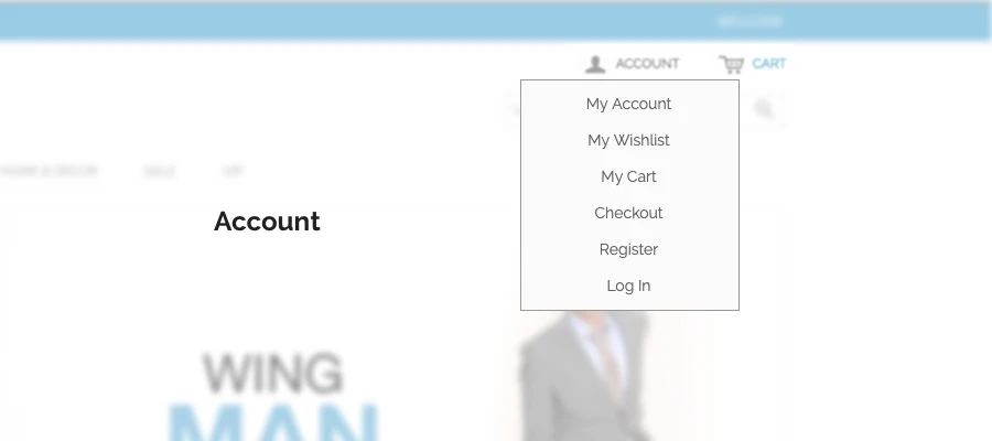
- Account
Account menu has been condensed to drop down link with custom JQuery for handy functions
Main Navigation

Some new plugins and different type of drop down has enhanced the looks. Also, a new “View All Items” link has been added at the head of every parent category.
Cart Menu
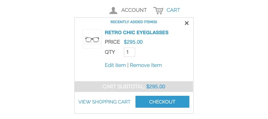
This has been condensed t provide more information with a 2-column layout to view individual products and order totals at a single glance.
-
Home Page Slider
There is a jQuery slider integrated in the rwd theme that lets you add an HTML list element as long as you have a JS file. The images and slider will appear automatically.
-
Filters and Grids
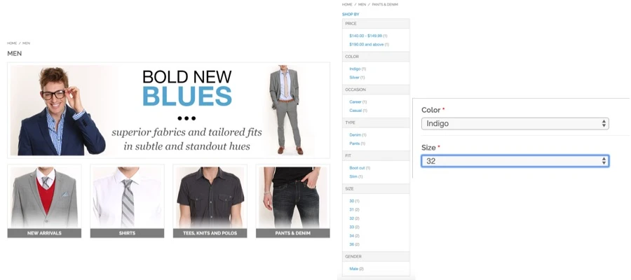
Filters are easier to navigate with collapsible features for the mobile device
-
Product View page
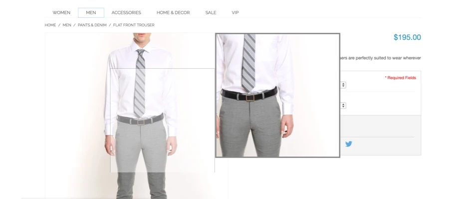
- Image zoom
- Image zoom
The default zoom feature available as a paid extension is now a standard integration on the new Magento CE 1.9. The new image gallery will bring forth the featured images and activate product zoom automatically.
Product Reviews
The product reviews are now available on the product page itself, which is very convenient as far s SEO goes.
Media Queries
You will come across a host of new Media Queries in the new responsive web design package of Magento CE 1.9. The new style sheets have five prominent breakpoints –
$bp-xsmall: 479px
$bp-small: 599px
$bp-medium: 770px
$bp-large: 979px
$bp-xlarge: 1199px
These have been taken from skin, frontend, scss, rwd, _var.scss and default. Some breakpoints have been introduced to repair broken layouts caused due to screen size variations. There is dedicated media query within ‘styles’ to address the pixel ratio requirements of retina display devices.
Mobile layout
A brief glimpse into the new responsive layouts
Desktop/Large Landing Page
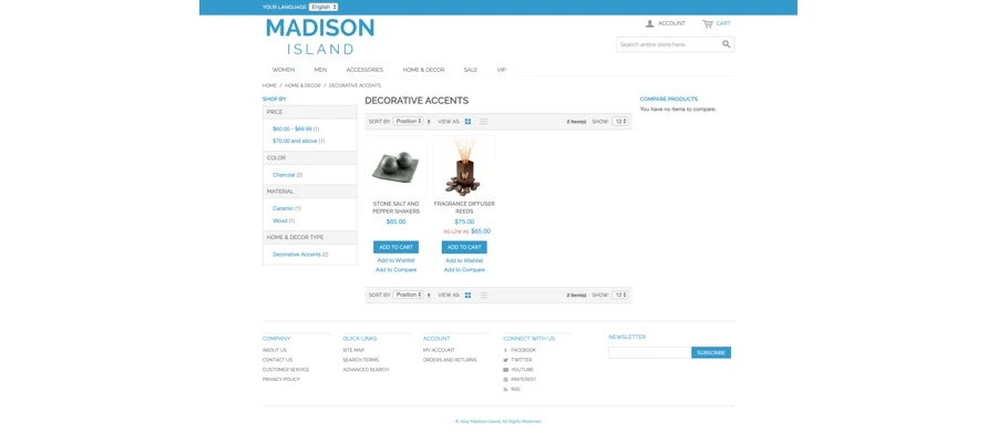
Text, buttons and spacing are all large on the product landing page
Tablet/ medium Landing Page
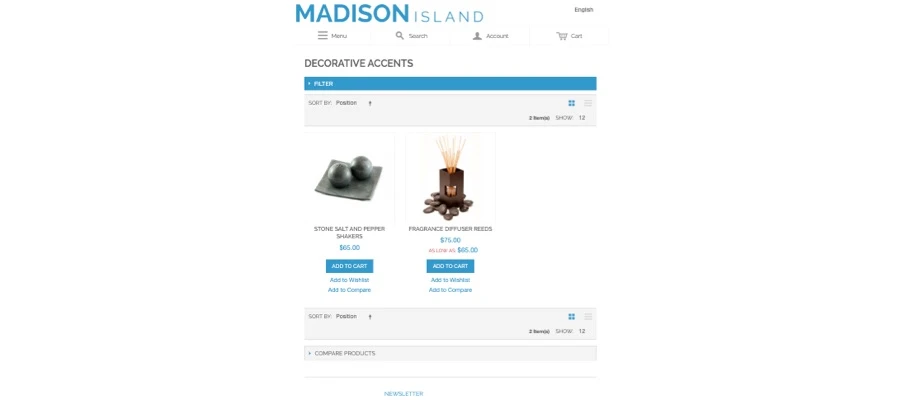
rid layout automatically changes from 4 to 3. Some of the clutter that occurs can be removed using the child theme
Mobile/Small Landing page
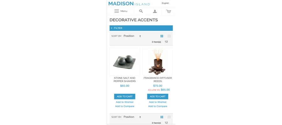
The left-hand filters navigation has been moved above the product grid, text and button size has been increased and when products are added to the shopping cart, there is an event flagging.
The new theme incorporates responsiveness and a host of other intuitive responses that lend the optimum user experience while making designing easier. A great amount of development time can be saved by simply adopting these new features to custom themes.

