10 Ways to Optimize Your Mobile eCommerce Checkout Page for Conversions in 2025
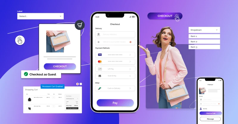
Table of Contents
In 2025, over 73% of all eCommerce traffic comes from mobile, yet mobile conversion rates remain 40% lower than desktop. A poor mobile checkout can kill your sales. This post explores 20 updated mobile checkout best practices that improve UX, speed, and conversions based on the latest data.
People using mobile for eCommerce checkout is almost equal to the desktop usage, in fact, minimally more. Therefore, it is important for us to make an ideal e-commerce checkout page, and more responsive themes for a better customer experience.
In this post, I have listed out some great tips which are best practices to make mobile eCommerce theme more responsive to improve conversion rates.
1) Designing for Fingers, Touch, People, and Not the Mouse
UX Professionals conducted many user research and came up with a few guidelines when designing for mobile devices. From the data collected, they found the behavior that how the user holds and interacts with the phone. The observation was that the users held their phones in three basic ways:
- One-handed- 49%
- Cradled- 36%
- Two-handed- 15%
We observed that most of the people are touching their screen using one hand, very large numbers of people also used different methods. The least-used case was two-handed use and is large enough to consider it during design.
However, This is just an approximate and depend on the individual to individual. I have observed cases where an individual is casually scrolling with one hand, then using two hands to type. Similar interactions are very common and can’t be generalized.

They also observed that over 40% of the users were interacting with the mobile phone without inputting any data via key or screen. Repeatedly observed cases found that thumb plays an important role in the screen touch experience of users. It means that we must build interfaces which are most comfortable to use with our thumb.
The researchers have also found out the easy, ok, and hard to touch areas so that you can place the important elements on those reachable areas of the screen noting the scrollability issue.
2) Break up checkout page into multiple pages.
In 2025, UI must prioritize bottom sticky buttons, one-thumb interactions, and single-column layouts due to increasingly large screen sizes and gesture-based navigation.
Checkout page is the only page which typically requires typing. What we have found out from our experience is that In 2025, while multi-page checkouts is still useful, many brands are shifting to single-page scrollable checkouts with smart section reveals and floating progress indicators, especially for mobile.
3) Get Shoppers through checkout as easily and quickly as possible
One of the common assumptions we make when designing mobile e-commerce is that users expect poorer performance when compared to desktop.
From my experience, I’ am telling you that users expect pages to load as fast as possible. Users now expect pages to load within 2 seconds or less—every 1-second delay can drop conversions by 10–20%
Often users are observed to abandon their carts due to poor e-commerce experiences which can be avoided by facilitating users by providing information they require the most.
The checkout behavior analysis in Google Analytics will help you determine where the visitor dropped off during the checkout process. This will help you optimize your user’s path towards and during the checkout process.
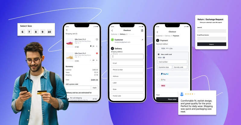
One way to practice this is to include all the important information the customer may want to know during the checkout process. For example, when I visit this online boutique to buy a gift for somebody (a crop top), here is what I experience once I’ve chosen which crop top I want to buy:
- Original price AND discounted price
- The options like Size Chart, Return Policy, Reviews are all there to help me make an informed decision
- The size of the product along with showing the unavailable sizes. If the person I am getting the gift for is small or a medium for example, I will not proceed and my time and energy will be saved
- Product description AND the height of the model wearing it (so I can compare it against the height of the person I am buying it for)
Here I have listed out few things which you must consider for faster mobile checkout.
- Place tab Next/Previous tabindex to enable shoppers to move between input fields.
- Avoid placing two or more fields in a single row.
- Auto-fill support.
- Bigger buttons.
- Numeric keyboards wherever required.
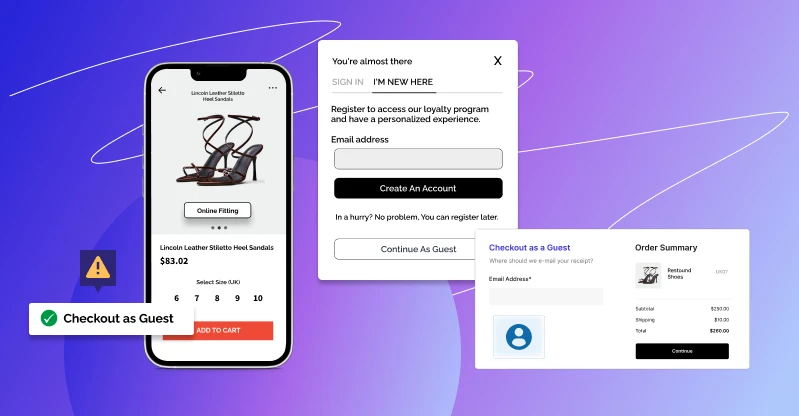
- Offer guest checkout.
4) Add some subtle gradient to call to action(CTA) buttons
Ensure that the only colored button on the checkout is the call to action button making it tempting to press. Use lighter colors for less priority CTA and darker colors for important ones.
You can get a lot of articles and blogs on the importance of color choices for CTA.
5) Make your end to end buttons big
It’s one of the design principles which we follow so that it is easy for users to touch their targets.
Ensure that checkout, guest checkout, next button or other CTA are big enough and at least 44 pixels.
6) Bigger Text Fields
It is important for you all to understand the data input from users and make it as easy as possible. Help icons or text about what information has to field which good touch response will significantly increase the overall UX. Always provide clear and visible labels for input text fields.
7) Click to Call
On the off chance that you just offering shoppers the choice to fill out a form to get in touch with you, you’re really demoralizing shoppers that could prompt a deal and offering poor customer service.
Ensure that a call us button is displayed on the checkout page, which diverts the users call to customer service and sales team in an effort to solve the customer’s problems. Studies show that by adding click to call you can increase conversion rate by 200%.
8) Guest Checkout
Many shoppers don’t like filling up a registration form to purchase a product and the number of these kinds of shoppers is in a quite considerable number. This may result in the big loss in your sales.
For that kind of shoppers place a guest checkout button above the sign in the button with fewer input fields.
9) Persistent checkouts
It is better to offer persistent cart options, it will send a message to the shoppers who have added their items to the shopping cart but didn’t proceed to checkout. Using this you can avoid cart abandonment.
You can make the shopping cart persist for certain days to help shoppers to make their purchase. A persistent shopping cart is the only way to retrieve information from a previous session for guest shoppers.
10) Use Expandable Menus
Accordions will help in hiding content as well as you won’t have to provide link for certain information. This will help in reducing distraction of customers on the checkout page.
Conclusion
In 2025, mobile eCommerce is no longer just an option; it’s the primary way people shop online. With more than 70% of traffic coming from smartphones, your checkout experience can significantly impact conversions.
A smooth, thumb-friendly, and fast-loading checkout page is crucial for keeping customers engaged and preventing cart abandonment.
From offering guest checkout and persistent carts to designing bigger buttons, cleaner forms, and quicker page loads, every small optimization contributes to a better user experience and higher sales.

Remember, mobile shoppers value speed, simplicity, and trust. By focusing on these core principles and applying the strategies discussed above, you can transform your mobile checkout into a seamless journey that not only improves conversions but also fosters stronger customer loyalty.
FAQs
 Why is mobile checkout optimization so important in 2025?
Because over 73% of eCommerce traffic now comes from mobile, but conversions are still much lower compared to desktop. If your checkout isn’t smooth, you’ll lose sales.
What is the biggest reason people leave during mobile checkout?
Slow load times, too many form fields, and being forced to create an account are the top reasons people abandon their cart.
Should I use a single-page or multi-page checkout?
Both work, but in 2025, many brands are moving toward single-page scrollable checkouts with progress indicators for a faster and cleaner experience.
How fast should my mobile checkout page load?
Ideally within 2 seconds or less. A delay of even 1 second can reduce conversions by 10–20%.

